New York City is alright. Its a town of hustle and bustle, and a place where you get off the subway and get yourself lost in no seconds flat.
Its full of annoying things like raucous taxis, yuppies, crowded sandwich shops, stores full of clothing that's more expensive than god, posers, those little dogs that like to bark at you for no reason, advertisers, and people.
Its also full of awesome things like stage shows, famous people, non-crowded sandwich shops, stores that have anything and everythin in existence, artists, ice skating rinks, reliable public transportation, and people.
The technical expertise here is very nearly palpable, -tastable-, you could practically squeeze it between your forefinger and your thumb, some places you go. Or at least, all the hundreds of godforsaken powerwalkers who flock and swarm along Fifth Avenue and Forty Second want you to think that.
New York is everything and anything, in the end, and that includes a self contradiction. The city is quite possibly one of the most confrontational cities around and it gets in your face like its got something to show you often. But more often then not when you stop and look and show your face back, you find in the end that nothing too much was looking you down in the first place.
So what have I been doing while I've been sitting pretty here in the Big Apple? Well let's see...
Anathema is complete. At long, long, long last.
How about I take you on a journey through its creation?
Yeah that sounds like a good idea.
IN THE BEGINNING, God created the animals.
No wait, that's too far back.
SO FIRST, I came up with the idea.
No wait, that's still too far back.
According to this blog the last thing I showed you guys was the animatic. So let's start from there, shall we?
The Story Reel, a sideways glance at a first look at a beginning:
So in any video project worth its salt, there ought to be video....footage plates shot onto which the effects and everything else are added and edited against.
Bit of a no-brainer, this one, I shot my footage somewhere around October when my most gifted talent, Joanna "Akemi" Micco was in town. She did a bangup job of the role I asked her to do, adn there's nothing like looking at a bit of raw video plate and saying "yeah this is gonna be awesome."
STORY REEL WAS HERE
I would know. That's what I did.
The Rough Cut + Color Correction, chipping, chipping away:
A rough cut, as any video editor/producer worth his salt would know, is first pass at editing a piece, after the footage has all been slotted into their placeholders, marked out in the animatic.
A little while ago, a friend of mine, working on the same project, asked me what the difference between a Story Reel and a Rough Cut was. And so I told him. His response was that meant that they were the same thing, since a good portion of the editing was supposed to have already been done in the animatic.
I didn't have a response to that.
ROUGH CUT BEHIND HERE
I did all my color correction in the same pass. Why? It was a button. Well, a button and a slider, and a few more buttons and some adjustments and a couple more sliders....what I'm trying to say is that I did it, and I did it because there wasn't that much tweaking needed for the editing.
The Effects Pass, like a backstage pass into WHOA (not really):
Here's where the brunt of the work happened.
X - HERE BE EFFECTSPASSES
The aim was to terrify. And every single effect, filter, slider, and button that I inserted into this was made towards that goal. If anything seemed like it didn't more rightly align the piece towards something unnerving, something discomfiting, something that would give the viewer that sense of -unease-, it got chucked.
At the same time my knowledge with Aftereffects, as I'm doing this is about as stable as a palsy victim tapdancing on a seesaw.
Continually change, continually morphing, and acquiring new parts like some hideous metallo-bionic collective, I found myself having to throw out half of the effects that I started with whenever I found something better.
Radial blurs got replaced with horizontal-restricted gaussian blurs. Manual camera shakes got replaced with time squeezes and remaps.
Text was added and adjusted in ways that I hadn't anticipated before and as is evident, even the ephemeral title sequence got a complete workover.
But I like it.
The Sound Pass, a valley of audio connecting the Sound Valley to the Sound Plains:
Sound effects are horror. They are what makes the scary terrifying, what makes the disquieting unnerving, and the disturbing horrifying. It adds that extra thick filmy layer of immersion that is so essential to pulling your audience in when you're trying to disturb them.
In other words, I had fun with this.
HEREIN LIES SOUND PASS, GOOD IN LIFE, BETTER IN COMPLETION
Putting together the sound effects for this monster was a bit of a doozy. I wanted to keep the backing "music" track, I'd refrained from inserting that particular track into any other project specifically for the purposes of this very project.
So what else? It didn't really feel cohesive unless the individual cuts had some other sound things going on top of it.
Originally I recorded a bunch of audio using my lovely little headphone mic...gasps, wails, groans, and strange mumblings.
Exactly ten seconds after I put them into the track, I threw them out. Homemade audio is not conducive to scaring people, unless you're going less for "scary" and more for "really freaking sketchy".
So I went back to the library of ambient tracks that I had originally pulled the backing "music" from and began slicing and julienning things as I saw fit and sliding them onto the tracks.
And I liked it.
The finished product that made it onto the DVD deviates exactly none from the finished Sound Pass. Everything up until that point had been polished out nicely before I moved on to the next step so I felt no real need to go back and whip a dead horse that's already primed for the races. ... ...
...
More on my other projects later.
Stay tuned.
Tuesday, December 25, 2007
Thursday, November 01, 2007
Lock, Stock and Some Other Things That Might Be Smoking
A few more highlights in the project, to show how things are coming along, more on all of this later.
This is the shot list, the name of which sounds kind of like a drunkard's to-do list. Aka fantastic.
Linky
MORE LATER
This is the shot list, the name of which sounds kind of like a drunkard's to-do list. Aka fantastic.
Linky
MORE LATER
Wednesday, October 31, 2007
What's He Storyboarding In There?
So in the motion visual arts industry we have this thing called a "storyboard". What is a storyboard? Well for the three of you out in the world older than 21 who don't know what it is, a storyboard is a board that tells the story.
Quite literally, when the storyboard was first invented deep in the bowels of the media infant that was dubbed "Disney", which would later grow monstrously and terribly into the media giant that was dubbed "Disney", it was a series of boards, likely cardboard or foamcore or whatever they used in those days, upon which an entire Mickey Mouse cartoon would be laid out in text and drawn frames. Each drawn frames represented a key moment in the animation that would help all the animators know what was going on.
Cut to the present day, two thousand seven, the cusp of a brilliant era that gave birth to high definition television, touch screen displays, motion capture, holograms, computer chipped coffee machines and weird subliminal Sprite commercials involving guys in huge green suits that really don't make you want to drink more Sprite. Really.
And a storyboard is still a series of boards, likely cardboard or foamcore or whatever. The difference now though is that they are not only limited to cartoons, and they are not only limited to Disney's inner sanctum.
After all. If they were, how in the world would I be using for my in-development Anathema project right now?
The answer is: pure willpower.
Friday, October 12, 2007
Zoom In On That Thing Right There
It's called "Anathema".
Or rather it will be called Anathema, once it gets made.
The assignment is I will have thirty seconds to scare the everloving fuck out of you and yours.
Now, like any good obsessive artist/filmmaker/motiongraphicisisist/closet psychotic I want to avoid cliches when making something like this. It helps that the cliches of the modern day horror extravaganza don't really consist of terrifying people anymore.
Certain horror flicks go with gore. All over the place. Intestines and stomaches and hearts and brains and chainsaws and knives and more intestines and more knives and hey how about some more intestines guys I think this scene needs more intestines what do you think more intestines, yeah more intestines. And that works sometimes, it gets a reaction out of the crowd.
Others go with LOUD NOISES.
....
....
....
LOUD NOISES
And that's always guaranteed to get the audience to jump, right?
But is it really scaring them?
Showing a few dozen liters of red liquid in a scene and throwing in some screams, murder weapons and maybe a lampshade made from human skin isn't really terrifying someone, as it is more of a elaborate and puppeted disgust dressed in the trappings of fright. Also unsanitary.
Flinging loud noises and sudden scary imagery onto the scene is the movie equivalent of jumping out of a corner and going "BLAGHLABLGKHAL". This too isn't scaring someone as it is just surprising the crap out of them.
Its cliches like these that I will seek to avoid. The gore, the gotcha moments, the sudden loud noises and things rushing towards the camera going "AAAHHH!"
Instead I will rely on things more substantial...chilling imagery, the unseen, the implications of the unknown and a vague conceptual story about a curse, or a possession, to grab you by your ribs and leave a mark.
Or, at least.
That is the hope.
The script has been revised, and a style sheet is available for your viewing pleasure. Check it ouuuuuttttttttttt. T.
Friday, October 05, 2007
Footslogging
There's new recent developments all over the damned place.
But for now:
Link (not Zelda)
Linkimus Rex
More on these later.
But for now:
Link (not Zelda)
Linkimus Rex
More on these later.
Friday, September 28, 2007
Dr. Media Or: How I Learned To Love The Message
Marshall McLuhan said that the medium is the message.
If this is true, then the message of most media these days is
LOOK AT ME LOOK AT ME PAY ATTENTION TO ME PLEASE AAHHH I CRAVE ATTENTION AHHHH mixed in with more than a healthy dose of "buy this because its awesome do it right now why are you still standing here looking at this go."
Needless to say, the last month has been a pure, unabashed and shameless complete orgiastic flood of media in all of its shapes, sizes and forms. Magazine, ads, books, video, ads, movies, DVD, billboards, video games, ads, and oh hey did I mention the ads?
In case you missed it, they're everywhere. On cars, on trains, on bathrooms, in the subway, in the sky, on the ground, on the sides of buildings, AS the sides of the buildings...
But the other day I was walking down 33rd street the other night, staring at a big cuddlepuddle of billboards on top of a collection of apartment buildings, telling me to get this new cel phone, and to buy more Gatorade in an extreme manner while sweating unhealthy looking colors. And I realized I was alright with it. And for this reason.
New York City is a city that breathes. Like you, me and that cat lying in the corner, it moves, pulsates, breathes and is alive, and not only that, it manages to pull off looking really cool in addition to that. And why?
The ads.
The billboards and the posters and the near technicolor eyegasmwashimitude of all the ads takes what would normally be a city full of stolid, sterile looking towers and skyrises sullenly staring down at the flood of people on the street and makes them all dance. It gives them color, it gives them expression, even if that expression is you need to stuff your face with this burger right now. Its like a masquerade ball, where instead of people its buildings, and instead of gold feathered masks its ads talking about how great juice is (especially this brand of juice which you need to go out and buy right now).
If it weren't for the ads, a lot of the city would be blocks. As a digital artist, I'm a whore for well done visuals, so I love all the billboards and ads ripping through the entire city.
The ads themselves look incredible too. We've come a long way from the day and age of curio-based ads and photo ads with helvetica and futura set on a drab gray background. Hell, even design itself has taken ginormous leaps and bounds since the days of Jugendstil and Art Nouveau.
I recently swiped a bunch of magazines from your friendly neighborhood bookstore. Check this out.
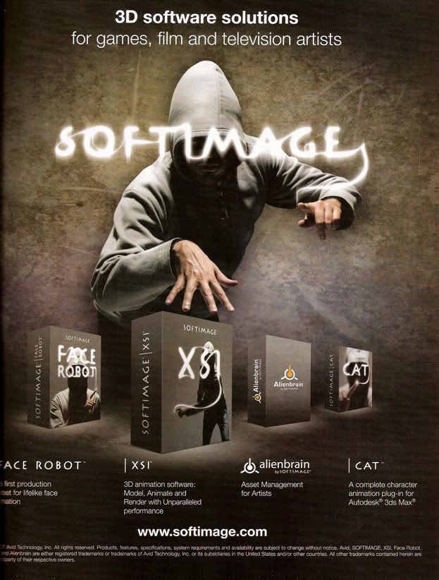
This is SoftImage's theme for their XSI software, lifted from 3D World magazine. Right here you can begin picking out the inspirations that drove the creation and the idea behind this piece. Its very centered. Strong, balanced.
Its human-centered, and revolves around the human in the ad, even though hoodie guy is completely anonymous. Newer influences that shaped this come from Hollywood, comics and film standbys...the strong shadows, the exaggerated pose that you could look at and you would swear it was a photo taken while the guy is in motion, even though it was probably set up over the course of four hours and the guy is probably sick of standing in the same position for the entirety of said four hours.
Not to mention the logo, a mystical, magical effect, the look of which was ushered in by ye olde After Effects generation, when suddenly making glowy mystal magical things wasn't so hard anymore.
Not to say everything is nothing but new and moving forward. Design tradition oldies are still goodies:
This is the first page of an article reviewing Adobe's interactive website advertisements in Communication Arts' annual publication.
Here we don't the fancy trappings of Lots of Fucking Effects and Filters, unless you consider text and lines to be Lots of Fucking Effects and Filters. But as a page, as a whole, it is well put together. Well designed, one might say. Why? Because even as a page that need bear the load of blocks and blocks of text, it still adheres to the formal elements of design, design standbys that have been with us forever, clocking in now at a millenia and a few centuries' change. Most importantly, the piece is balanced.
And finally:
Concept art for an unholy abberation against god, nature and every fluffy puppy in the world named "Schism", from the soon-to-be-released Silent Hill 4.
This is the new face of the terrifying, o ladies and gentlemen, and it is oh so very telling. Long time ago, horror consisted of a bunch of standbys, most of which were pulled from books and stories which had no visuals in hand to slap you in the face with: Frankenstein's monster, the Werewolf, Dracula, the Mummy, Zombies.
Ever since Hellraiser came out in the late eighties, however, that sort of thing took a bonesplitting surge forward.
Why is this so telling? Ours is an era where both art and design has flowered outwards beyond our diminutive little frames, our normal modes of thought. Some would say it has become even greater. Its become one of the big cornerstones of our new generation, and that's fast evolution.
Here's how it goes. Someone watches a bit of media. Its not really that out there, but it breaks new ground. This someone, being an artist or a designer, sees the ground broken and immediately pushes past the broken area into the new areas beyond. His work subsequently becomes more out there, even more groundbreaking, and even more evolved beyond our normal modes of thought. Someone else sees this artist's work, its kind of far away, but the vast area of this new ground expands her mind.
Then she sees the ground broken, and she, being an artist or a designer, immediately steps past the broken area and into even newer areas, pushing it farther. The next artist comes along and does the same, though their mind must expand that much further from their "normal" modes of thought.
If this trend continues one day art and design will both be beyond the reach of human comprehension while being infinitely accessible at the same time.
But Patrick! This sounds intimidating and scary and... worry not dear reader, for you can always remember two things.
One: I'm one guy, one short, asian guy sitting in front of a computer. There are probably thousands of short asian guys sitting in front of computers who could tell you I'm crazy.
Two: Design and art are almost always moving forward and changing, but its memory and its filial piety are near impeccable. Art and design are, in the very end, nothing more than expression and communication through unusual means. Art and design both started as cave paintings scrabbled all over some walls, and to this day, this method of expression through art and design can still leave a mark. I am of the belief that art and design will never forget its roots, even if its artists and proponents do.
That's what makes it so excellent.
God bless you, mediation. Bless you right in your stupid, stupid face.
PS: I have a new project idea, now in treatment format. Its here -> Chain Link Fence
If this is true, then the message of most media these days is
LOOK AT ME LOOK AT ME PAY ATTENTION TO ME PLEASE AAHHH I CRAVE ATTENTION AHHHH mixed in with more than a healthy dose of "buy this because its awesome do it right now why are you still standing here looking at this go."
Needless to say, the last month has been a pure, unabashed and shameless complete orgiastic flood of media in all of its shapes, sizes and forms. Magazine, ads, books, video, ads, movies, DVD, billboards, video games, ads, and oh hey did I mention the ads?
In case you missed it, they're everywhere. On cars, on trains, on bathrooms, in the subway, in the sky, on the ground, on the sides of buildings, AS the sides of the buildings...
But the other day I was walking down 33rd street the other night, staring at a big cuddlepuddle of billboards on top of a collection of apartment buildings, telling me to get this new cel phone, and to buy more Gatorade in an extreme manner while sweating unhealthy looking colors. And I realized I was alright with it. And for this reason.
New York City is a city that breathes. Like you, me and that cat lying in the corner, it moves, pulsates, breathes and is alive, and not only that, it manages to pull off looking really cool in addition to that. And why?
The ads.
The billboards and the posters and the near technicolor eyegasmwashimitude of all the ads takes what would normally be a city full of stolid, sterile looking towers and skyrises sullenly staring down at the flood of people on the street and makes them all dance. It gives them color, it gives them expression, even if that expression is you need to stuff your face with this burger right now. Its like a masquerade ball, where instead of people its buildings, and instead of gold feathered masks its ads talking about how great juice is (especially this brand of juice which you need to go out and buy right now).
If it weren't for the ads, a lot of the city would be blocks. As a digital artist, I'm a whore for well done visuals, so I love all the billboards and ads ripping through the entire city.
The ads themselves look incredible too. We've come a long way from the day and age of curio-based ads and photo ads with helvetica and futura set on a drab gray background. Hell, even design itself has taken ginormous leaps and bounds since the days of Jugendstil and Art Nouveau.
I recently swiped a bunch of magazines from your friendly neighborhood bookstore. Check this out.
This is SoftImage's theme for their XSI software, lifted from 3D World magazine. Right here you can begin picking out the inspirations that drove the creation and the idea behind this piece. Its very centered. Strong, balanced.
Its human-centered, and revolves around the human in the ad, even though hoodie guy is completely anonymous. Newer influences that shaped this come from Hollywood, comics and film standbys...the strong shadows, the exaggerated pose that you could look at and you would swear it was a photo taken while the guy is in motion, even though it was probably set up over the course of four hours and the guy is probably sick of standing in the same position for the entirety of said four hours.
Not to mention the logo, a mystical, magical effect, the look of which was ushered in by ye olde After Effects generation, when suddenly making glowy mystal magical things wasn't so hard anymore.
Not to say everything is nothing but new and moving forward. Design tradition oldies are still goodies:
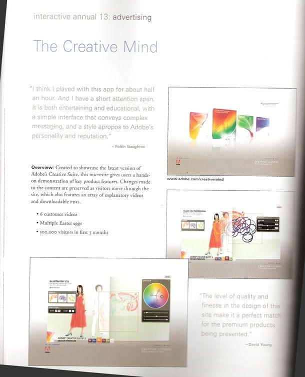
This is the first page of an article reviewing Adobe's interactive website advertisements in Communication Arts' annual publication.
Here we don't the fancy trappings of Lots of Fucking Effects and Filters, unless you consider text and lines to be Lots of Fucking Effects and Filters. But as a page, as a whole, it is well put together. Well designed, one might say. Why? Because even as a page that need bear the load of blocks and blocks of text, it still adheres to the formal elements of design, design standbys that have been with us forever, clocking in now at a millenia and a few centuries' change. Most importantly, the piece is balanced.
And finally:
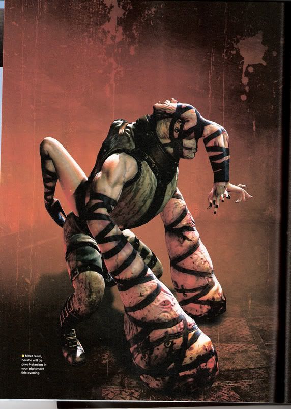
Concept art for an unholy abberation against god, nature and every fluffy puppy in the world named "Schism", from the soon-to-be-released Silent Hill 4.
This is the new face of the terrifying, o ladies and gentlemen, and it is oh so very telling. Long time ago, horror consisted of a bunch of standbys, most of which were pulled from books and stories which had no visuals in hand to slap you in the face with: Frankenstein's monster, the Werewolf, Dracula, the Mummy, Zombies.
Ever since Hellraiser came out in the late eighties, however, that sort of thing took a bonesplitting surge forward.
Why is this so telling? Ours is an era where both art and design has flowered outwards beyond our diminutive little frames, our normal modes of thought. Some would say it has become even greater. Its become one of the big cornerstones of our new generation, and that's fast evolution.
Here's how it goes. Someone watches a bit of media. Its not really that out there, but it breaks new ground. This someone, being an artist or a designer, sees the ground broken and immediately pushes past the broken area into the new areas beyond. His work subsequently becomes more out there, even more groundbreaking, and even more evolved beyond our normal modes of thought. Someone else sees this artist's work, its kind of far away, but the vast area of this new ground expands her mind.
Then she sees the ground broken, and she, being an artist or a designer, immediately steps past the broken area and into even newer areas, pushing it farther. The next artist comes along and does the same, though their mind must expand that much further from their "normal" modes of thought.
If this trend continues one day art and design will both be beyond the reach of human comprehension while being infinitely accessible at the same time.
But Patrick! This sounds intimidating and scary and... worry not dear reader, for you can always remember two things.
One: I'm one guy, one short, asian guy sitting in front of a computer. There are probably thousands of short asian guys sitting in front of computers who could tell you I'm crazy.
Two: Design and art are almost always moving forward and changing, but its memory and its filial piety are near impeccable. Art and design are, in the very end, nothing more than expression and communication through unusual means. Art and design both started as cave paintings scrabbled all over some walls, and to this day, this method of expression through art and design can still leave a mark. I am of the belief that art and design will never forget its roots, even if its artists and proponents do.
That's what makes it so excellent.
God bless you, mediation. Bless you right in your stupid, stupid face.
PS: I have a new project idea, now in treatment format. Its here -> Chain Link Fence
Friday, September 21, 2007
And We're Live In Three....Two....
In a perfect world, this is where I'd fill in one sentence to stand in as the body of my blog, and leave the rest of you, oh dear sparse and few readers and spammers copious and plenty, riding the edges of your seats. What is he going to say next? He left off at two...what happened to one?? What happens when he gets to one??? Will there be prizes, and damned if I should submit....pie?!?!?
In a perfect world, you would be doing that, instead of reading this.
In a perfect world, there would be rainbows and kittens and bunnies.
In a perfect world, I would have seventeen ho-jillion dollars, and an army of robotic sex slave concubines that are capable of dominating the world for me while simultaneously delivering ice cream and massages to me every six seconds.
This is not a perfect world.
But hey, not that I'm complaining. As I write this, I'm currently sitting deep within the bowels of the concrete, metal, shitstained beast they call Brooklyn, New York. I'm a twenty minute subway ride from the heart of Manhattan, bar none one of the greatest cities in existence. There's gatorade in my fridge. There's a grocery within pissing distance of my apartment. There's a broken down car in front of my apartment building. And I have no bed.
Its like I'm living one of the best damned dreams ever.
God bless grad school.
Also, god bless debt.
But hey, its not a perfect world.
In other not completely unrelated news, rabid ferrets have invaded my apartment and are trying desperately to sell me life insurance.
Actually that's a lie, that's not as unrelated as you'd think.
But I've got one big project coming up. This one's on delivery courtesy of CADA at the NYU SChool of Continuing and Professional Studies. Chances are it'll fuse a lot of AfterEffects, and a little bit of Photoshop.
THe problem here is, of course that I barely know anything about AfterEffects. I'm like a toddler, who's had new feet surgically implanted onto his ankles. I don't know much about what I'm supposed to do.
I was however, asked to come up with some ideas for projects that I could do.
Some thoughts thus far:
STYLE: Horror
TECHNIQUE: Blending effects and filters, with strong emphasis on composition in general.
Using these tools, I'll attempt to create in motion one of my favorite ambiances that I have been creating for so long in stills: that of the horrific. The fusion of metal and flesh, the horrors of death, the horrors of life, all the things surreal and terrible that place us on edge.
STYLE: Punk/Rebel
TECHNIQUE: Rotoscoping and that neat line-drawing/scrawling effect that everyone and their mother uses.
Lots of moving around is planned, and heavy emphasis on aspects of punk/rebel culture will be used to portray the feeling. Expect graffiti, tattoos, mohawks, and kids that have bad attitudes. Or at least look like they do.
STYLE: Nu-Medieval
TECHNIQUE: Streamlined motion, 2d image layering, lights and other solid effects
A style of medieval that merges the ancient with aspects of modern design and technology that I dreamed up one day is going to be the focus of this one. It will celebrate a culture that has no gunpowder, has standardized bioengineering and has fused the primitive and the advanced that will hopefully be described as beautiful anachronistic.
In other words, I have barely any idea what I'm doing. I've been tooling around with AfterEffects for about two, going into my third week now, and I still have a whole metric fuckton to learn. I'd be more confident about taking on this project if I knew more. In a perfect world, I'd know AfterEffects like the back of my hand, and I'd have some storyboards by now.
But this is not a perfect world.
Subscribe to:
Posts (Atom)