If this is true, then the message of most media these days is
LOOK AT ME LOOK AT ME PAY ATTENTION TO ME PLEASE AAHHH I CRAVE ATTENTION AHHHH mixed in with more than a healthy dose of "buy this because its awesome do it right now why are you still standing here looking at this go."
Needless to say, the last month has been a pure, unabashed and shameless complete orgiastic flood of media in all of its shapes, sizes and forms. Magazine, ads, books, video, ads, movies, DVD, billboards, video games, ads, and oh hey did I mention the ads?
In case you missed it, they're everywhere. On cars, on trains, on bathrooms, in the subway, in the sky, on the ground, on the sides of buildings, AS the sides of the buildings...
But the other day I was walking down 33rd street the other night, staring at a big cuddlepuddle of billboards on top of a collection of apartment buildings, telling me to get this new cel phone, and to buy more Gatorade in an extreme manner while sweating unhealthy looking colors. And I realized I was alright with it. And for this reason.
New York City is a city that breathes. Like you, me and that cat lying in the corner, it moves, pulsates, breathes and is alive, and not only that, it manages to pull off looking really cool in addition to that. And why?
The ads.
The billboards and the posters and the near technicolor eyegasmwashimitude of all the ads takes what would normally be a city full of stolid, sterile looking towers and skyrises sullenly staring down at the flood of people on the street and makes them all dance. It gives them color, it gives them expression, even if that expression is you need to stuff your face with this burger right now. Its like a masquerade ball, where instead of people its buildings, and instead of gold feathered masks its ads talking about how great juice is (especially this brand of juice which you need to go out and buy right now).
If it weren't for the ads, a lot of the city would be blocks. As a digital artist, I'm a whore for well done visuals, so I love all the billboards and ads ripping through the entire city.
The ads themselves look incredible too. We've come a long way from the day and age of curio-based ads and photo ads with helvetica and futura set on a drab gray background. Hell, even design itself has taken ginormous leaps and bounds since the days of Jugendstil and Art Nouveau.
I recently swiped a bunch of magazines from your friendly neighborhood bookstore. Check this out.
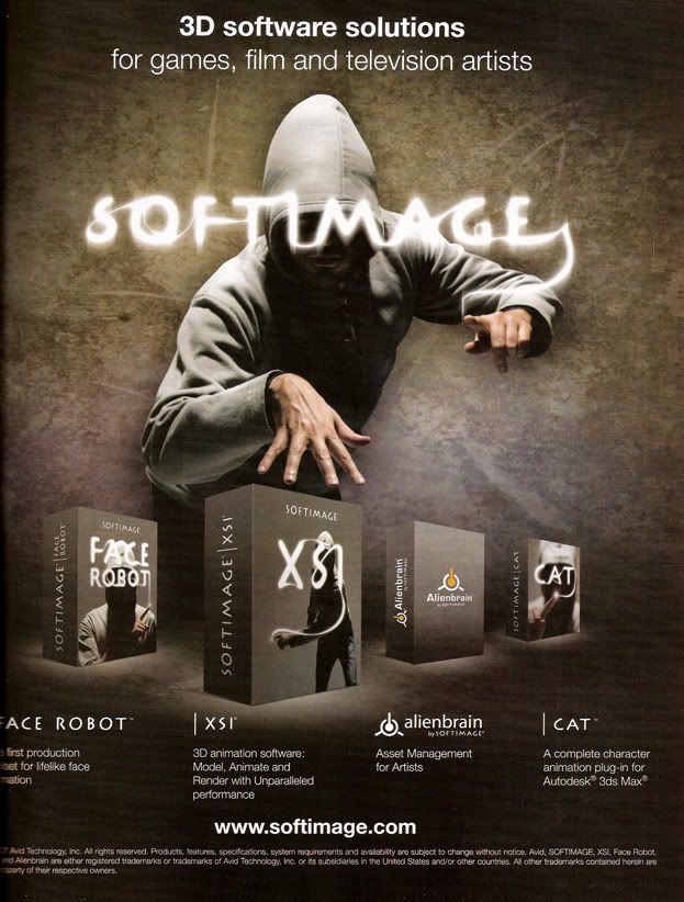
This is SoftImage's theme for their XSI software, lifted from 3D World magazine. Right here you can begin picking out the inspirations that drove the creation and the idea behind this piece. Its very centered. Strong, balanced.
Its human-centered, and revolves around the human in the ad, even though hoodie guy is completely anonymous. Newer influences that shaped this come from Hollywood, comics and film standbys...the strong shadows, the exaggerated pose that you could look at and you would swear it was a photo taken while the guy is in motion, even though it was probably set up over the course of four hours and the guy is probably sick of standing in the same position for the entirety of said four hours.
Not to mention the logo, a mystical, magical effect, the look of which was ushered in by ye olde After Effects generation, when suddenly making glowy mystal magical things wasn't so hard anymore.
Not to say everything is nothing but new and moving forward. Design tradition oldies are still goodies:
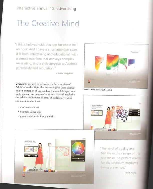
This is the first page of an article reviewing Adobe's interactive website advertisements in Communication Arts' annual publication.
Here we don't the fancy trappings of Lots of Fucking Effects and Filters, unless you consider text and lines to be Lots of Fucking Effects and Filters. But as a page, as a whole, it is well put together. Well designed, one might say. Why? Because even as a page that need bear the load of blocks and blocks of text, it still adheres to the formal elements of design, design standbys that have been with us forever, clocking in now at a millenia and a few centuries' change. Most importantly, the piece is balanced.
And finally:
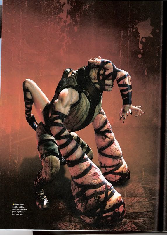
Concept art for an unholy abberation against god, nature and every fluffy puppy in the world named "Schism", from the soon-to-be-released Silent Hill 4.
This is the new face of the terrifying, o ladies and gentlemen, and it is oh so very telling. Long time ago, horror consisted of a bunch of standbys, most of which were pulled from books and stories which had no visuals in hand to slap you in the face with: Frankenstein's monster, the Werewolf, Dracula, the Mummy, Zombies.
Ever since Hellraiser came out in the late eighties, however, that sort of thing took a bonesplitting surge forward.
Why is this so telling? Ours is an era where both art and design has flowered outwards beyond our diminutive little frames, our normal modes of thought. Some would say it has become even greater. Its become one of the big cornerstones of our new generation, and that's fast evolution.
Here's how it goes. Someone watches a bit of media. Its not really that out there, but it breaks new ground. This someone, being an artist or a designer, sees the ground broken and immediately pushes past the broken area into the new areas beyond. His work subsequently becomes more out there, even more groundbreaking, and even more evolved beyond our normal modes of thought. Someone else sees this artist's work, its kind of far away, but the vast area of this new ground expands her mind.
Then she sees the ground broken, and she, being an artist or a designer, immediately steps past the broken area and into even newer areas, pushing it farther. The next artist comes along and does the same, though their mind must expand that much further from their "normal" modes of thought.
If this trend continues one day art and design will both be beyond the reach of human comprehension while being infinitely accessible at the same time.
But Patrick! This sounds intimidating and scary and... worry not dear reader, for you can always remember two things.
One: I'm one guy, one short, asian guy sitting in front of a computer. There are probably thousands of short asian guys sitting in front of computers who could tell you I'm crazy.
Two: Design and art are almost always moving forward and changing, but its memory and its filial piety are near impeccable. Art and design are, in the very end, nothing more than expression and communication through unusual means. Art and design both started as cave paintings scrabbled all over some walls, and to this day, this method of expression through art and design can still leave a mark. I am of the belief that art and design will never forget its roots, even if its artists and proponents do.
That's what makes it so excellent.
God bless you, mediation. Bless you right in your stupid, stupid face.
PS: I have a new project idea, now in treatment format. Its here -> Chain Link Fence